I don’t typically pay too much attention to the ethnicity (aka admixture) estimates on the different DNA partners but I noticed that Family Tree DNA just updated their ethnicity estimates and there’s been a lot of whoopla over it. It seemed as if they added more categories, or finer resolution.
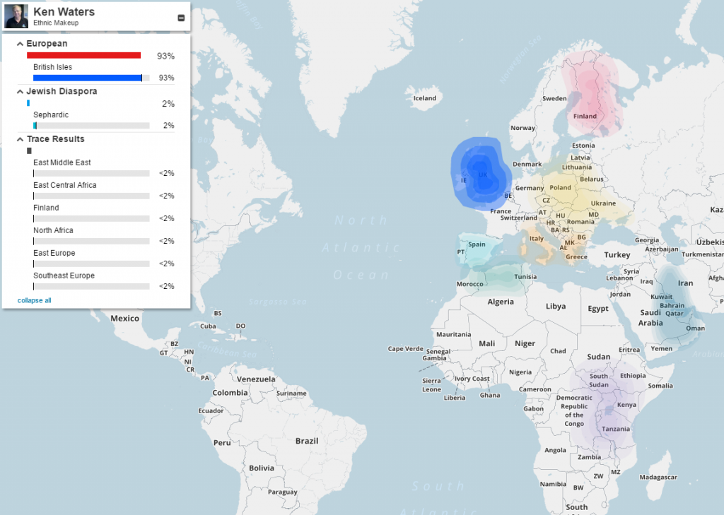
Well, here is my map:

This was quite disappointing given that I have a well-documented 25% Portuguese line. The map shows that area as 2% Jewish Diaspora rather than Iberian (which is supposed to be a category). Also, it indicates that nearly all of my European is from the British Isles. I do have documented lines back to France, Germany, and Flemish, none of which is covered.
The previous version of their MyOrigins map was much closer to reality. Oh, well—I’ll just go back to focusing on the real reason I’m into DNA testing so much: doing chromosome mapping to find living cousins and using them to help fill in my family tree.